Update: Agent File Upload and Usability Improvements
This update improves the ability to upload files to the Agent, as well as the overall usability.
You can upload files right in the chat window and attach them to your analysis, and the sidebar and analysis result screens have been polished to be more consistent so you can quickly tell where you are. We also improved the time it takes for the first response to appear and how exceptions are handled.
Why we need this
The more your analysis data takes the form of tables or documents, the harder it is to ask exactly the question you want through a text input alone. You either upload the file on a separate screen and then return to the conversation to connect it, or the result screens are scattered, forcing you to pause your analysis flow and re-check the values.
This update closes that gap so you can upload data within the chat window and carry it all the way through to the analysis results in a single flow.
File upload within the conversation
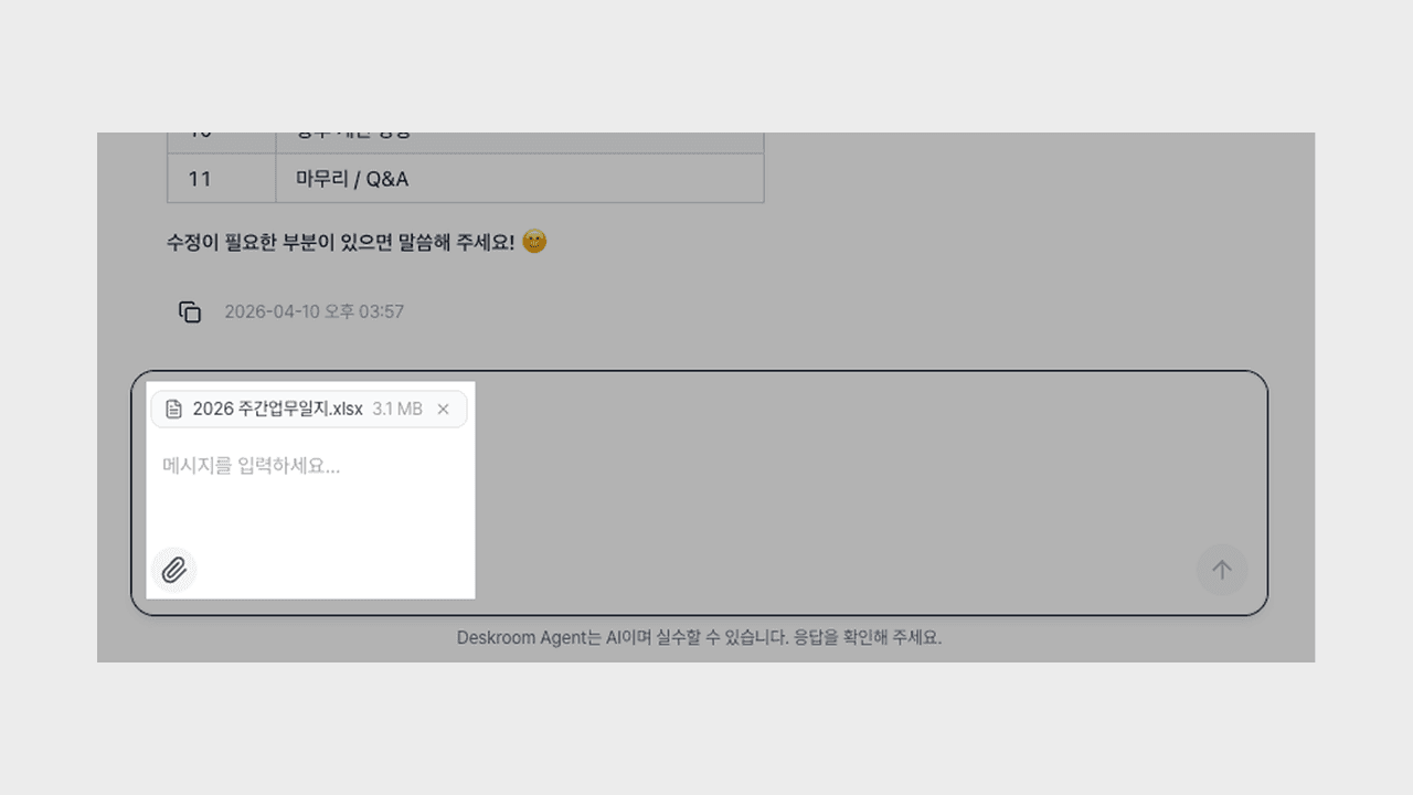
You can upload files right in the chat window and continue your analysis in the same flow.
- Instant attachment: You can upload a file either with the attach button or by dragging and dropping it into the input field, and the moment you upload it, it is bound to your message so you can continue asking questions without switching screens.
- Stored per conversation: Uploaded files are grouped by conversation in the file list on the right panel, so you can see them at a glance and pull them out again.
- Re-check from the message: Which file you sent with a previous message is shown right in the message, with the file name and size.
Now you can handle tasks like "Let me upload the monthly sales table and walk through the trend together," "Let me pull out the topics that come up often in the customer support logs," or "Let me upload the proposal document and summarize just the key message" within a single thread of conversation.
Agent screen usability improvements
We tidied up the screens you spend the most time on to be more consistent, so you can quickly tell where you are and what you are looking at.
- Sidebar position emphasis: The conversation you are currently viewing is highlighted in the sidebar with a background color, and the title of the selected conversation is clearly shown in black at the top.
- Tidied analysis results: We applied the existing metric icons to the metric list cards as-is, and unified the empty-state display of the metric and search result cards into a single shape.
- View metric details: When you go into the detailed view from a summary card, we made sure the chart unfolds together exactly as it should.
Now, even as you move between multiple conversations, you can read at a glance where you are and whether the results have been filled in.
Response speed and stability
We reduced the time until the first response and polished things so analysis continues smoothly even in exceptional situations.
- Shorter time to first response: We brought forward the point at which an answer starts to appear right after you send a question.
- Stronger exception handling: Even if a temporary error occurs during an external model call, the conversation continues naturally without stopping.
- Tidied result grouping: We organized the grouping so that analysis results arriving in succession do not appear scattered.
Now the flow of asking a question and waiting for an answer is shorter, so you can move on to your next question faster.
You can try it right away from the Deskroom sidebar > Agent. You can spend the time you used to spend moving data and aligning screens on asking questions and making decisions.