Summary Dashboard

Deskroom's custom dashboard has been updated. Expanding one step beyond the existing custom dashboard feature, you can now handle not only VOC data but also a variety of metrics such as transactions and advertising.
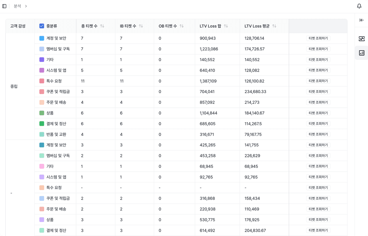
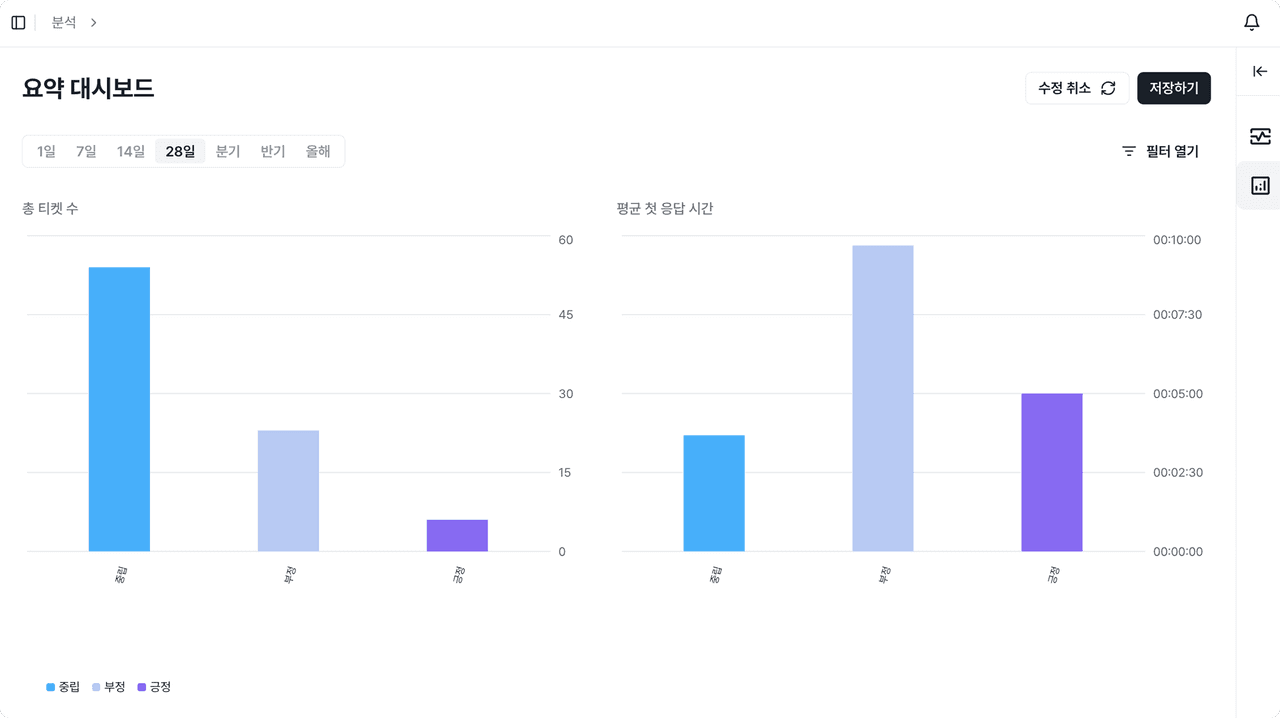
The third feature of the new custom dashboard is the [Summary Dashboard]. You can quickly check representative values such as the total, average, and proportion over a given period, and use them effectively in report writing and performance reviews.
Why we made this
When analyzing business data, you need to check not only the trend of change but also the data over a specific period. Previously, you had to download the data, set the period you wanted to view, calculate totals and averages yourself, and move back and forth between multiple sheets. This process took a long time to produce a report and amounted to repetitive work.
Deskroom simplified this process. The Summary Dashboard automatically aggregates the total, average, and proportion of data over a given period and lets you easily compare by property and keyword. Users can reduce unnecessary calculation work and grasp key metrics faster and more accurately.
Examples of use
When you want to compare monthly cumulative totals and average values
- You can compare the totals and averages of monthly support counts, VOC volume, and sales metrics at a glance.
- You can verify performance against KPIs or quantitatively check whether improvement effects have actually materialized.
When you want to analyze the proportion of key metrics by property or keyword
- You can aggregate and check the support proportion by channel, the VOC ratio by category, the sales proportion by keyword, and more.
- By identifying which property accounts for a large share of overall performance, you can pinpoint the areas where you should concentrate resources.
When you want to write a summary report of data aggregated by a specific criterion
- You can use the automatically aggregated total and average data as-is to write reports quickly.
- You can produce reports based on consistent metric standards without building formulas or doing calculations every time.
How to use
Click the [+] icon at the top left to create a Summary Dashboard. When you select the metrics to analyze, they are automatically reflected in the chart and table.
- Chart: Visualizes the metric value (Y-axis) against property/keyword (X-axis)
- Table: Provides the total, average, and proportion of the selected metric as precise figures
When it is hard to grasp all the data with a single metric, you can split the data by property and keyword to analyze it more deeply. In addition, with the filter feature you can set date, property, and keyword conditions to precisely analyze only the range of data you want.