Trend Dashboard
Deskroom's custom dashboard has been updated. Expanding one step beyond the existing custom dashboard feature, it can now handle not only VOC data but also a wide range of metrics such as transactions and advertising.
The second feature of the new custom dashboard is the [Trend Dashboard]. By splitting data by property or keyword, you can quickly spot the overall trend over time, outliers, and inflection points.
Why we made this
When viewing metrics, it is easy to miss the flow of change if you look only at simple cumulative figures. Whether a metric spiked after a specific event, whether it moves differently by channel, or whether an outlier occurs only for a specific keyword can only be seen by looking along the time axis.
But previously, you had to download the data, organize it by date, and build a pivot table. This process was cumbersome and time-consuming, and it also carried the risk of errors that could make you miss an important signal.
Deskroom automates this process.
The trend dashboard automatically aggregates metrics along the time axis and lets you split and analyze the data by property and keyword. Instead of spending time on repetitive organizing, you can quickly grasp metric changes and focus only on the important decisions.
Example use cases
When you want to check how much a specific metric increased or decreased on a weekly basis
- You can monitor the trend of metric change on a weekly basis to evaluate KPI attainment or campaign performance.
- If a specific metric fluctuates lower or higher than expected, you can quickly diagnose the cause and prepare your next action.
When you want to track whether an outlier occurred in a metric after a specific event
- You can compare metric changes before and after events such as a promotion, a new product launch, or a price change.
- You can catch outliers such as sudden spikes or drops early and build an immediate response strategy.
When you want to compare metric changes by channel or by keyword as a time series
- You can split metric changes by channel (e.g., chat, phone) or by category and view them as a time series.
- By tracking data for a specific keyword, you can see in real time which issues or trends are spreading quickly.
How to use it
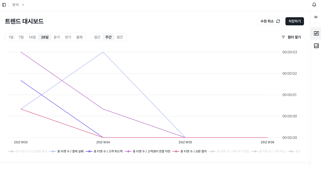
Click the [+] icon in the upper left to create a trend dashboard. When you select the metric to analyze, it is automatically reflected in the chart and table.
- Chart: Intuitively shows how a metric value (Y-axis) changes over time (X-axis)
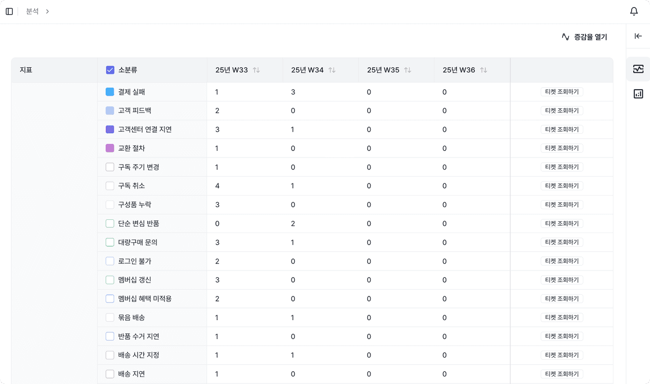
- Table: Lets you compare metrics by property and by keyword in detail, based on time intervals
When a single metric is not enough to grasp all the data, you can split the data by property and keyword for deeper analysis. You can also use filters to set conditions for date, property, and keyword, so you can precisely analyze only the data range you want.