Update: Metric Deep Dive

As data accumulates and classification becomes more refined, it becomes hard to gain insight from simply listed numbers alone.
Rather than just "there's a pattern in this big top-level category," you have to drill down into which type within it is especially a problem before it leads to actual action.
This update focuses on letting you drill deeper into data on the dashboard.
Detailed analysis by property hierarchy
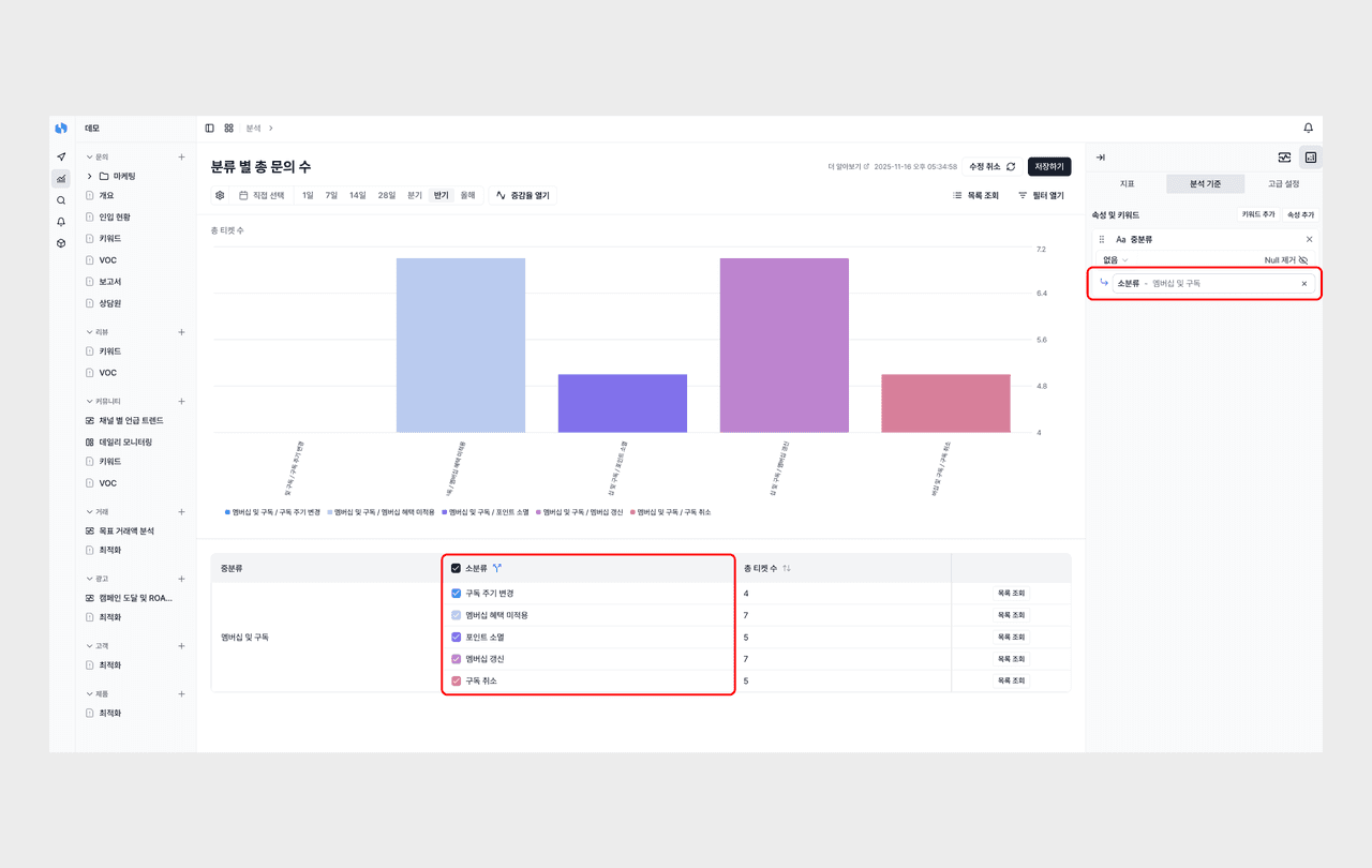
By setting up parent-child relationships between properties, you can analyze metrics in detail on the dashboard.
For example, suppose there are two properties, "top-level category" and "sub-category." When you click the top-level category "Membership & Subscription," the sub-categories beneath it (subscription cycle change, membership benefit not applied, point expiration, and so on) expand, and you can check the detailed distribution right away.
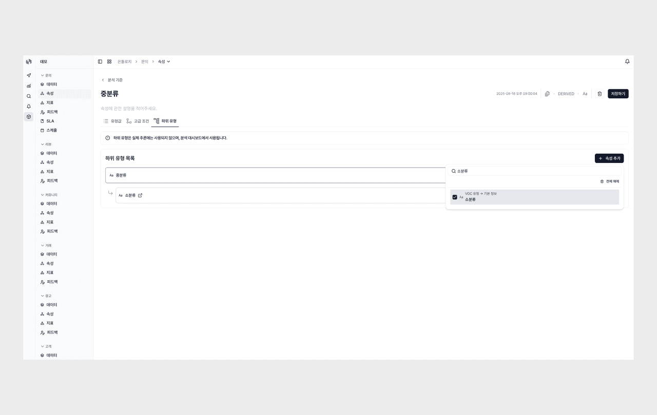
You can set up the hierarchy between properties in the "Sub-type" tab of the property screen. When you manage metric types hierarchically, like top-level category → middle category → sub-category, you can explore from the overall picture down to the detailed cause in one go, so the analysis flow doesn't break.
Stacked Chart
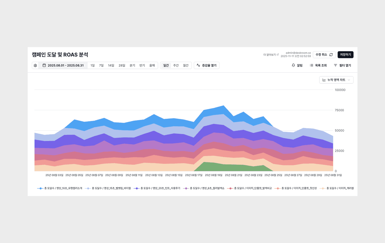
Along with detailed analysis, we support a Stacked Chart that lets you see at a glance how the sub-types are composed within a single bar.
From a chart that only showed the overall figure, you can now stack and compare the share of each detailed item. You can grasp how much of the whole each type accounts for, and which detailed type surged within it, all in the same chart.
Small but handy updates
Pinning the list view
You can pin a list filtered by specific conditions on the dashboard. Instead of setting up the query conditions you check often every time, you can save them and access them right away.
Setting the start day of the week
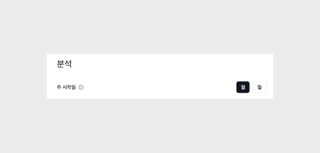
In the date filter, the start day of the week is determined by your setting. Just choose to start on Monday, Sunday, and so on, to fit how your business operates. It is especially useful when collaborating with global teams or overseas clients.
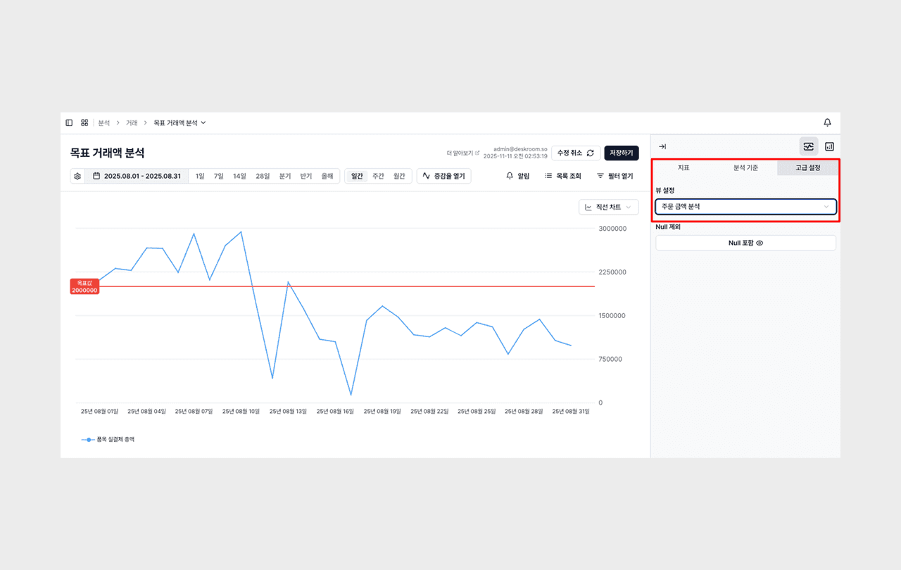
Hide empty values option
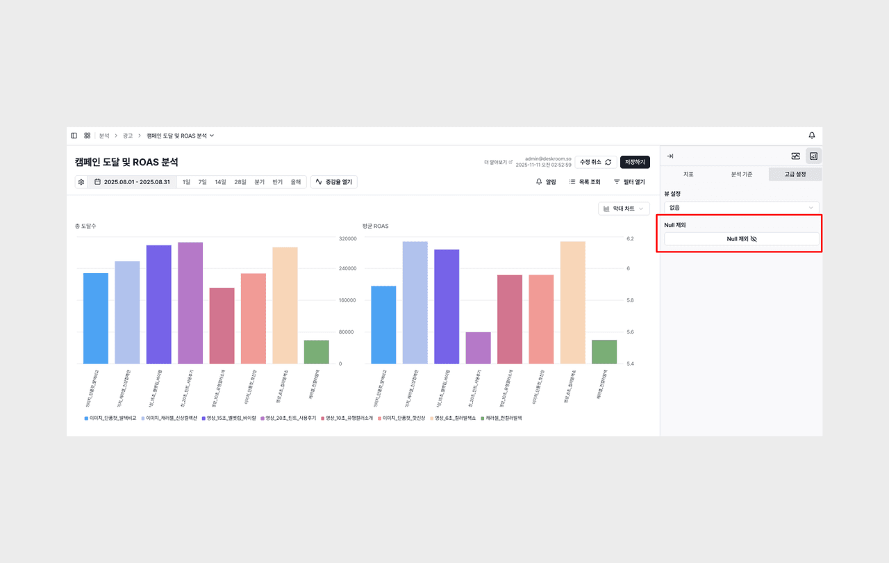
A setting was added to hide the empty values shown as "-" on the dashboard. When you click Exclude Null in the dashboard's [Advanced Settings], you can keep only meaningful data and view charts and tables more neatly.