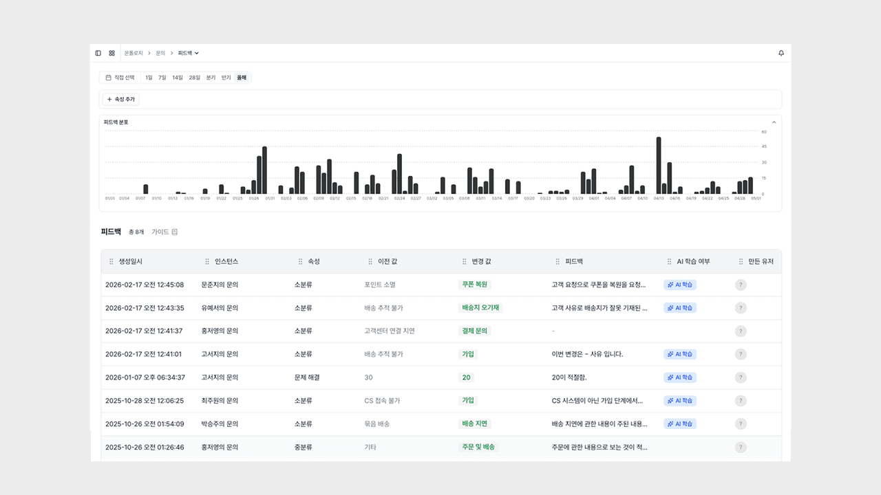
Update: Feedback Daily Chart

This update adds a daily chart to the feedback list.
You can review feedback as a distribution along the time axis, narrow it down by your desired range and properties, and check detailed feedback right away.
Why we made this
We added a daily chart so you can see the flow of feedback occurrence at a glance along the time axis. By applying a date range filter and property filters together, you can quickly check when and how much feedback occurred for your desired range and properties.
It helps you pinpoint the flow of feedback rising and falling along the time axis right away, while monitoring AI response quality.
Daily Distribution Chart
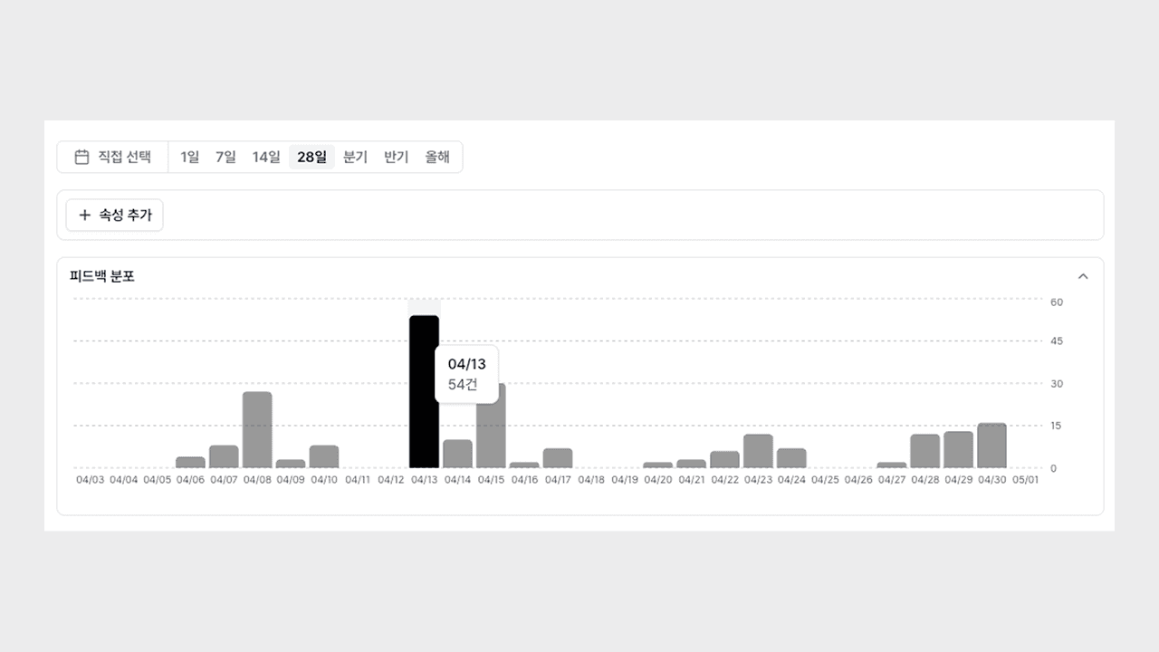
It shows when and how much feedback occurred as a bar chart along the time axis.
- Time-axis visualization: Organizes the volume of feedback over the selected period into a daily bar chart.
- Trend comparison: You can spot patterns that differ from the norm or moments of abnormal spikes at a glance.
- Linked with the list: The chart and the feedback table below it share the same data, so it naturally connects from distribution to the source.
Now you can grasp when feedback increased and decreased right away along the flow of time.
Period, Property, and Date Filters
You can narrow the chart down by your desired range and properties, and drill down to a specific date.
- Date range filter: Specify an analysis range to review only the feedback distribution for that period.
- Property filter: Selecting a specific property updates the chart to a daily distribution limited to that property.
- Bar-click drill-down: Clicking a daily bar makes the table below show only the feedback for that date.
Now you can review the broad trend at a glance, and then dive right into the detailed feedback along that flow.
You can try it right away on the Deskroom sidebar > Feedback page. While monitoring AI response quality, you can grasp when and how feedback occurs more quickly.